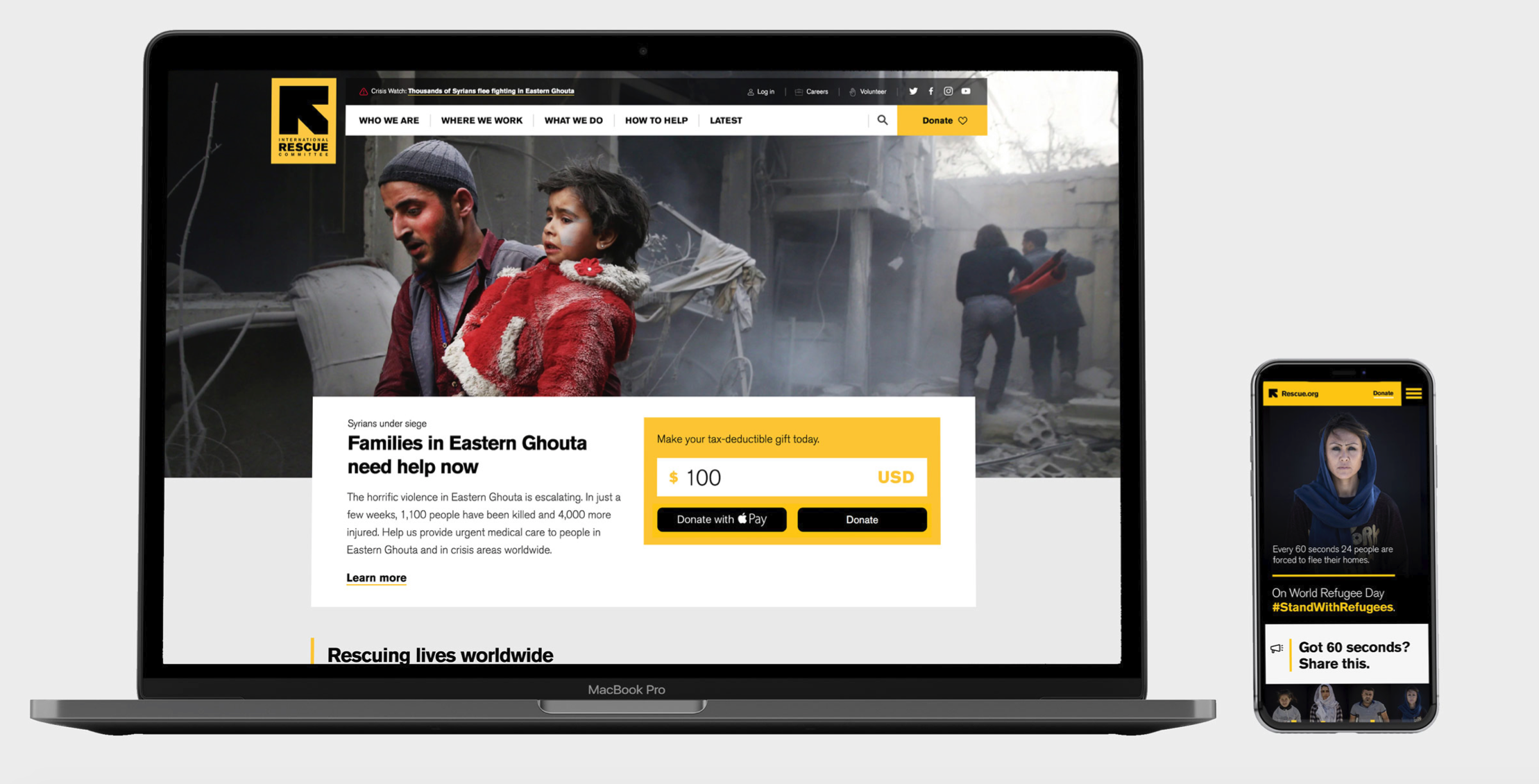
Rescue.org
Redesign and Content Strategy
Led a full scale redesign and reframed content strategy for the International Rescue Committee’s flagship online presence at Rescue.org.
Challenges and Objectives:
The International Rescue Committee is a global humanitarian aid agency with programs in 40 countries around the world and a $1.5 billion aid portfolio. The online communication and marketing needs of the organization had long-since outstripped its basic, blog-centered web site. IRC’s new President charged me with developing a category-leading web presence that would effectively showcase the organization’s vital work..
The redesign was part of a broad organizational plan (Strategy 2020) focused on growing the IRC’s international supporter base in multiple markets, increasing revenue from public and private funders, and expanding its impact for refugees..
Design Strategy
I hired a leading interactive agency (Code & Theory) to help shape a strategic blueprint for the service that would address audience and business priorities. We conducted interviews with 30+ stakeholders across the organization (Program and Country Directors, Advocates, Fundraisers, and Market Leads); compiled audience research; and developed personas and user scenarios. Over three months, we mapped out the user experience and created a powerful and modern design to represent the brand.
Content Strategy
The original site had grown organically and was a sprawling mass of rich, but out-dated information. We did a full content and SEO audit and decided to streamline.
Our reframed content strategy was modeled on information services like Vox and AXIOS, and was shaped by an AXIOS-invented concept: “smart brevity.” Our busy, globally-oriented audience had limited time to spend with us on complex issues. We needed to distill our information. We set out to provide them with the key, need-to-know facts and the IRC’s unique insights about front-line humanitarian crises.
Our language and visual presentation avoided the jargon and dense technical analysis of United Nations web sites and communication. We kept it simple and human.
Build
The build was completed in-house, by my then lean-but-mighty digital team (1 UX design lead, 2 developers, 3 content producers, 1 project manager) in a series of agile sprints over six months. The project included a full platform upgrade from Drupal 6 to 7.
The developers built an elegant “embeddable” framework which allowed us to combine varied page elements based on a defined rule-set to create a set of flexible and rich layouts. The framework was fully mobile responsive..
Roll-out
A global roll out was part of the plan from the get-go. The site’s flexible design anticipated the use of multiple languages, including right to left text treatments.
Our UX lead created Design System that could also be extended to other digital products and platforms (i.e. we also had commerce and donation products). The developers set up systems and processes to seamlessly maintain consistency and standards across a universal code-base.
Results
The launch of the flagship main site produced double-digit increases in site engagement and conversion rates.
The new framework created numerous efficiencies for content producers and developers.
It also enabled speedy launches in new market instances. We subsequently rolled out the platform in the U.K,, Germany, Sweden, and Brussels, with more new market launches on the way.


